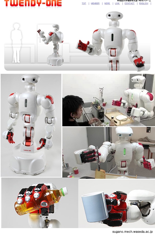
출처 디자인디비

WMF 일인용 커피메이커, 디자인: Designafairs, 제작: WMF AG
커피 메이커에 컵, 전선등이 미리 포함되어 있고 물도 한 잔 분량만큼만 넣을 수 있게 되어 있다.다른 조작이 필요없이 단추만 누르면 40초안에 커피를 내릴 수 있다.

야채 트위스트 기, 디자인: Nose AG Design Intelligence (Oliver Beger/ Christian Harbeke), 제작: Betty Bossi Verlag

데 롱기 아침식사 기기 세트, 디자인: Marco Vaona, 제작: De Longhi S.p.A

a. 켄우드 토스트기, 디자인: Jamie Weaden, 제작: Kenwood Lit.
b. 아로마 에스프레소 기, 디자인: Iwasaki Design Studio, 제작: Ricordi & Sfera Co.

퍼즐형 쟁반, 디자인: Leon Ransmeier, 제작: Royal VKB
숟가락과 포크, 나이프, 접시, 컵 등을 손잡이 달린 퍼즐로 만들어 아이들에게 놀이의 즐거움을 주는 동시에 아이들이 잘 떨어뜨리는 것들을 제자리에 놓게 만들어준다.

어린이용 의료 마스크, 디자인: Designafairs GmbH, 제작: Pari GmbH

a. 폭풍우용 우산, 디자인: Gerwin Hoogendoom, 제작: Seny Umbrellas BV
비바람이 칠 때 우산을 옆으로 눞혀도 머리위로 떨어지는 비를 비할 수 있도록 만들어진 우산
b. 자석앞핀, 디자인: Hironao Tsuboi, 제작: 100% Tokyo
c. 의족 <트리아스 1C30>, 디자인: Matin Pusch / Lueder Mosler, 제작: Otto Bock HealthyCare GmbH, 베스트 오브 더 베스트

a. 브라이트 보청기, 디자인: Philipp Gruetzner / Ben Crook, 제작: Bemafon AG
b. 어린이용 접이식 휠체어

a. MP3플레이어 <올리브 Olive>, 디자인 및 제작: Ours Technology Inc.
b. 디지털 라이너 PCM 레코더, 디자인: Hiroki Oka, 제작: Sony Corporation

a. 디나 포인트 웹 캠
b. 소형 큐브형 USB

a. 방수 MP3 플레이어 <돌핀 Dolphomn>, 디자인: Duck Image Co.Ltd, 제작: NU Inc.
b. 아이팟 방수 스피커 <뮤직튜브 Music Tube>, 디자인 및 제작: Nova Design Co. Ltd.
c. 테두리가 없는 수경, 디자인: Designsymbiosis (Arthur Ferguson / Prof. Stephen Allard) + Atomic Aquatics Designteam (Doug Toth / Dean Garaffa), 제작: Atomic Aquatcs Inc.
d. 물놀이 신발 <트리보드 S100 Tribord S100>, 디자인 및 제작: Decathlon

아디다스 골프 신발

화물차 <네트라스 시티 엘 3.5 Netras City-L 3.5>, 디자인: Motio Development BV, 제작: Netras Mobile Systems

a. 재활용기 압축기
b. 벽난로
 a. 종이접기 의자와 탁자, 디자인: Demacker Design, 제작: van Esch bv b. 다기능 가구  스피커가 설치된 의자 <소닉 체어 Sonic Chair>, 디자인 및 제작: Designatics production GmbH  쉐즈롱지 <음양>, 디자인: G. Nicolas Thomkins, 제작: Dedon GmbH 베스트 오브 더 베스트  샤워기 <비의 춤, 비의 폭포 Raindance Rainfall>, 디자인: Phoenix Design, 제작: Hansgrohe AG  침대욕조 <썬덱 Sundeck>, 디자인: EOOS Design, 제작: Duravit AG 베스트 오브 더 베스트  벨기에 기차역 설치물, 디자인: Stefan Schoening, 제작: SNCB  런던 포나리나(Fornaina) 매장 인테리어, 디자인: Giorgio Borruso/ Mariana Del Rey |
필요한 자료가 있어서 스크랩 했는데 같이 봐요~ ^^ CI, 로고마크 트랜드 '07~'03(CI, logomarktrends2007~2003) At LogoLounge.com we look at A LOT of logos and see plenty of trends: Some are aesthetic, some conceptual, and some cultural. As the internet's largest database of logos – over 50,000 to date – you can't help notice the evolution of design – and trends. For instance, we have seen many more 3-D logos that are designed to be in motion, never still or flat. These designs have completely shaken the earthly bonds of CMYK and exist only in ethereal RGB: The old logo design rules just don't apply to them. Another development: Today, for many trends there is now a countertrend – and this is not only the case for logo design. The public and its likes and dislikes have become fragmented across the spectrum. Companies who need logos and designer who create logos are forced to respond accordingly. It has become increasingly difficult to simply look in one direction or the other. It is also becoming disturbingly clear that logo design has become a public sport. As the public controls their own media more and more–Tivo-ing this, blogging that, YouTube-ing and Googling everything else–people are no longer satisfied to simply consume what is placed before them: They have opinions they want to share. So when a large corporation reveals its new identity, there are hundreds of internet sites flinging their opinions back at it. Even when the village board of Remote votes on a new logo for its two police cars, citizens take to the streets waving pitchforks and copies of their own designs. Committeecide seems to be rampant. The full 2007 trend report follows. Whether we are noting social, conceptual or aesthetic trends, remember that none of them exist in a vacuum or in a single moment in time. They are results of many trends before them and are developing taproots as we speak. Also, you will note some amount of aesthetic crossover between trends. For instance, the Dos Helix and Ribbon trends do show similarities. But with these categories and all others, we are more interested in the difference between their fundamental concepts. Our observations are just that–observations. They are not recommendations. Finally, they are presented in no particular order. Dos Helix 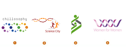 Deoxyribonucleic acid really sounds like the last thing that could influence design until you knock it down to the initials DNA. It's the root of life and the code responsible for the past and the future of any living entity. The double helix strand has now transcended the field of science and, over the last generation, moved comfortably into the field of pop culture. Hollywood has turned DNA into the glow-in-the-dark plot twist of CSI "insert city here". The design community has latched onto the twisting double helix structure as the public now sees this shape as a spark of life or the signature of an individual. Representing the genus or the seed of life, health and longevity, a family tree, a code, a mystery, or an unbroken sequence, these strands have a certain symbolic power that can be agreed upon by science or religion alike. 1.Design Firm: lwdgraphics Client: Chillosophy 2.Design Firm: Sumo Client: Science City 3.Design Firm: Demasi Jones Client: RCRH 4.Design Firm: Gibson Client: Women for Women Rubber Bands  Invista, one of the worldlargest integrated fiber businesses, most succinctly laid claim to this look in 2003 with "the rings of innovation" designed by Enterprise IG. It's easy to imagine the global aspect of the company and the interlinking products and efforts with the bisecting fiber like rings. (though to the public or an untrained eye, this may well look like a random assembly of rubber bands in your top desk drawer). This is a trend that connects directly to directions from previous years–Natural Spirals and Cave Rings, specifically. This is chaos and geometry coming together. These linking rings tend to express the concept of a collective of product, employees, companies, or divisions that work together as a larger whole. They may appear to have varying degrees of autonomy or flexibility based on the tightness or shape of their configurations. Color is generally the marker that defines individuality, but it also helps us grasp the concept of the whole being greater than the sum of the parts. 1.Design Firm: Koch Creative Group Client: MBM Study 5 2.Design Firm: Substrate Client: Zilo 3.Design Firm: Grafikonline Client: Guba 4.Design Firm: Enterprise IG Client: Invista Radiance 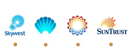 Not since the introduction of day-glow ink has there been this kind of illumination in the design industry. The brilliance of light is pervasive, and it seems to have found new ways to manifest itself. Radiance comes from the sun, but it is also beaming from water, pearls, books, and even the X-Box in an alien sort of way. The diversity of application ranges broadly from transparent overlays, gradients, and reflections, to lens flares, and animation. These marks have a certain warmth that conveys comfort not to dissimilar from the light at the end of the tunnel. This glow may become more prevalent as we try to convey optimism, purity, warmth or escape. But the fallback position for this much wattage is still a guiding light or source of knowledge. 1.Design Firm: Cato Purnell Partners Client: Skywest Airlines 2.Design Firm: Gardner Design Client: The Center 3.Design Firm: LandDesign Client: Sunhaven 4.Design Firm: Siegel+Gale Client: SunTrust Eco Smart 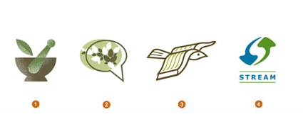 The loudest drum for the corporate world to stay in step with continues to be sustainability. In one form or another, our ecological welfare has been the crux of a trend in every report LogoLounge has released. The fact that we are still reporting its influence is not an agenda but is testament to the sustainability of sustainability. These Eco Smart identities are simply getting smarter. Trees and leaves are still there, but the application has taken a more intelligent approach. It could be that some prior adopters of green identities were merely giving lip service to the cause. It's not just about adopting the color green. These logos are blended with an application and an ethos, more sensitive to the environment. The marks have grown up and seem to be telling stories with a softer voice, not with a piercing shrill. 1.Design Firm: Gardner Design Client: Dandurand 2.Design Firm: Ulrichpinciotti Design Group Client: Resources for Healthy Living 3.Design Firm: Eggnerd Client: Greenhill Academy 4.Design Firm: Steve's Portfolio Client: Small Planet Lit 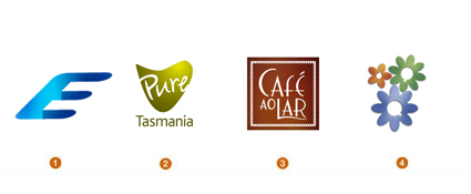 Designers continue to play havoc with the remnants of the rules set forth years ago for logo design. Production limitations are no longer relevant as marks vault into CMYK. In addition, many designers and clients have figured out that they will never, ever print their logos in the Yellow Pages – so producing at least one version that is 2-D and one-color is not necessary at all. Over the last several years, we've seen logos crystal capped, light pinged, and puffed up like a silicone implant. The concept is simple: Create a degree of reality that allows an image to lift off of the page. This dimensionality lets the logo play on a different field than the world of flat one- and two-tone marks. Not subtle, but effective. Now enters subtlety via the well-lit logo. Actors have been told for ions to step into the lights, and now logos are doing the same. It's little more than intelligent stage craft. These logos are not necessarily dimensional; in fact, most are relatively unassuming. The primary difference is the illusion of good lighting. It's an understated effect that pays off well in capturing the consumer's eye. 1.Design Firm: Zed+Zed+Eye Creative Communications Client: Ebert Pool Construction 2.Design Firm: FutureBrand Client: Pure Tasmania 3.Design Firm: Sebastiany Branding Client: Cafo Lar 4.Design Firm: Cato Purnell Partners Client: Flower Factory Pseudo Crest 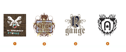 Mix a little nose-in-the-air, overly stodgy, family coat of arms with a sharp tongue-in-the-cheek, Napoleon Dynamite liger, and you have something that approximates a Pseudo Crest. These are fun, and packed with detail that sticks it to the man at every opportunity. For the high school and college market, Jason Schulte's firm, Office, built a best-of-class brand for Target with the Independent Studies line. At first glance, most of these look like they've been lifted from a heraldry 101 style book, until you scrutinize the composition elements. Only at this point are you likely to see wrenches, guitars, penguins, shoes, cell phones and anything else you'd never expect to find in Camelot. This is a youth anthem; and designers have identified this as a source language for fashion culture and the music industry. In fact, this is a modern trend you will see everywhere, despite its roots in heraldry and even other intricate patterning like Victorian wallpaper. 1.Design Firm: Office Client: Independent Studies/Target 2.Design Firm: Reaves Design Client: JCPenny Nation 3.Design Firm: Miles Design Client: 12 Gauge Wakeskates 4.Design Firm: Launchpad Creative Client: Astonish Entertainment Urban Vinyl 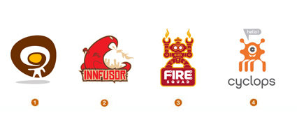 Charlie the Tuna and the Jolly Green Giant, these are not. Advertising characters have danced the line between logos and mascot for years. Even the Cingular Jack was a bit of a hybrid with a personality that animation played out beyond the printed page. Urban vinyl is a subculture that is starting to cross over into logo design. These small vinyl characters are ubiquitous shelf clutter, enshrined in nearly every designerdesk collection. First made popular in Hong Kong by Michael Lau in the 90's, these imaginative imps have become highly collectable and have entire stores, KidRobot and magazines, Super 7, dedicated to their notoriety. The art of Tim Biskup may start on canvas but it soon translates to designer vinyl characters. Usually they can be as mundane as fire breathers to as outlandish as slimy cyclops ghost aliens. Though not a serious influence on Fortune 500 identities, urban vinyl has its place in pop culture, and that has translated to two-dimensional applications in logo design. 1.Design Firm: San Markos Client: webpublica 2.Design Firm: Innfusion Studios Client: Innfusor 3.Design Firm: Glitschka Studios Client: Fire Squad 4.Design Firm: Tactix Creative Client: Cyclops Hubs 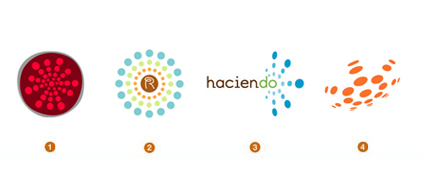 Last year, Apurba Sen from India contacted LogoLounge after he had taken a few hundred Web 2.0 logos and arranged them based on the trends recognized in LogoLounge reports over the last 3 years. It was an interesting experiment and served to confirm several of our previous categories. But one abundant group of these logos that found no harbor with previous trends was the Hub. These logos have a central element that serves as the core with many satellite elements, often orbiting symmetrically. These logos could serve as the model of a communication structure for any online community. There is a central hub that serves as the dissemination point for information. Without the hub, the satellites lose their ability to make contact with the other members of the group. So whether these logos are for a communication tool or not, the distribution from a central point is usually key to the concept. The other aspect of this technique is many elements coming together for a greater common good. As prolific a theme as this has become, designers continue to build unique visual concepts. 1.Design Firm: Selikoff+Co Client: Pomology 2.Design Firm: Starlight Studio Client: RM Custom Creations 3. Design Firm: Brent Leland Design Client: Haciendo 4. Design Firm: Demasi Jones Client: Fibre Optic Australia Descending Dots  Once you've started looking for this concept, you will see it everywhere–including in other categories within this report. With very few exceptions, these logos are made out of a series of dots either ascending or descending in scale consecutively. Most of these logos depict motion to help advance their message. Imagine using this language as a shorthand for static animation. It's basically the Eadweard Muybridge stop-motion freeze-frames-turned-logo, except each earlier frame is a bit dimmer or smaller than the next. As we feel more compelled to explain motion-related concepts in a unique fashion, we will discover new visual language that will help us achieve this. In previous reports, we discussed the use of less traditional techniques to define motion, including, Blur, Dot Fuzz, and Blow out. Descending Dots rely on vector edge graphics to achieve their effect, much as Robert Miles Runyon used stripes to help define his Stars in Motion for the 1984 Los Angeles Olympics. The fallout of this era was a decade or more of logos that, by virtue of their sweeping stripes, all declared loudly, "I am moving." 1.Design Firm: Ardoise Design Client: Raymond Engineering 2.Design Firm: Aron Creative Client: Springboard 3. Design Firm: Glitschka Studios Client: Windows Gaming 4. Design Firm: Brand Bird Client: Arby's Franchise Association Flora 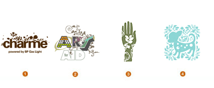 Let's just make the assumption if you water a logo and give it adequate sunlight, it will start to grow a rhythmic crop of vines, buds, blooms and other fantasies of a botanical nature. These may be further evolution of last year's Embellish trend, or they could just be another subset of a larger trend. This would be a direction that uses borrowed remnants of a patterned, Victorian era to attach a delicate human quality to the hard outer shell of an other wise sterile logo. Detail of this nature is inherently engaging and asks the consumer to participate visually in a non-confrontational fashion. A number of designers have been responsible for this tracery-like visual language, but the pioneering work of the Netherlands's Tord Boontje has probably gained the greatest notoriety. Tord was responsible for the delicate, and intricately diecut POP materials used for the 2006 Holiday presentation at Target. This layering of highly embellished organic lace has influenced identity design, especially in retail application. 1.Design Firm: Shift Design Client: Charme 2.Design Firm: Doug Beatty Client: Art for Aid 3.Design Firm: Gardner Design Client: Holly Root Massage 4. Design Firm: Entermotion Design Studio Client: Marshmallow Kisses Half 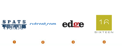 An optimistic outlook will assure us these logos are half full. Engaging the public to participate with the identity has always been a strong method of building a tie to a logo. That "aha!" moment, when clever information assimilates and comes into focus, is the moment we take ownership in an entity. The secret here is not to bury the punch line so deeply that the consumer never gets to it. Here, the missing half of a visual element tells the story. Where is the other half and why? Has it been chopped off, is it just over the edge, or is it submerging, or emerging? Simple word play or, in some events, image play allows the consumer to associate the product with an action. Cutting off part of an image can in some cases become confrontational, however, and cutting a perfectly good number or letter in half is tantamount to heresy in some cases. Letters are sacred to consumers: Altering them is one thing, but removing their better half makes people look. 1.Design Firm: Fresh Oil Client: Spats Logo Concept 2.Design Firm: Thomas Manss & Company Client: Cutcost.com 3. Design Firm: Meme Design Client: Edge 4. Design Firm: Miles Design Client: Urban Forward Overlap 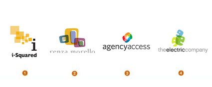 In some respects, this is an evolution of last yearOverlay trend and a definite continuation of the strong transparency genre in logo design. While still relying on relatively flat color overlay–like so many layers of colored lighting gels–this direction is more concerned with linkage. These logos describe sets and subsets as an analogy for the literal connections within a corporation. Remember that transparency is a strong buzzword in the corporate world: The need to be fiscally and otherwise transparent to the public, employees, and investors is an essential trait. Elements coming together with nothing to hide help to extol the depth or diversity of an institution. The overlapping subsets can often be used to help tell a story or explain the architectural structure of the organization. Advances in software have made the process of designing transparent imagery much more inviting. Adobe Illustrator, for example, allows a designer to experiment and see transparent techniques in real time as opposed to the arduous steps that Photoshop would require to achieve the same result. 1.Design Firm: Fitting Group Client: i-Squared 2.Design Firm: Cacao Design Client: Renza Morello 3. Design Firm: Matthew Schwart Design Studio Client: Agency Access 4. Design Firm: Gillen's Army Client: The Electric Company 3D 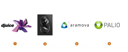 For years, logos have been taking on more dimensional characteristics as they have become puffier, reflective, or glassine. But in general, these are more of an affected surface treatment, as opposed to an all-out "Here's what my backside looks like." As soon as a logo takes on full three-dimensional qualities, unanticipated questions start to arise. If I spin the logo a quarter turn, is it still my logo? If I zoom in on it from an angle that obscures, is it still my logo? If I turn the lights down on it, is it still my logo? If I go through traditional trademark channels, can I register this dimensional object from any perspective? Miles Newlyn is the London designer responsible for the proposed B logo for a major telecommunications company. Additionally, he is one of the premiere go-to designers if you need a breakout concept, such as his identities for 3 or ish. Miles attributes one of his inspirations for three-dimensional logos as the Jaguar hood ornament which is immediately recognizable from any angle. The challenge with a true 3-D logo is that a company must have the media resources necessary to convey the identity in its full spectrum of dimension. This is why many of these logos settle for the appearance of great dimensionality from a single perspective, not the real thing. Miles remains a leader in this emerging direction: He notes that being able to create a 3-D logo is not as important as is knowing which clients need them. But more and more, businesses are requesting them just to be stylish. 1.Design Firm: Wolff Olins Client: djuice 2. Design Firm: Miles Newlyn Client: B 3. Design Firm: GrafikOnline Client: Aramova 4. Design Firm: Substrate Client: Palio OpticaLine 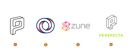 Who doesn't stop mid-step when confronted by an optical illusion? We just feel compelled to give it a second look and evaluate it. Whether we look at these as a challenge or an amusement, they demand our attention. Optical illusions are generally linear in nature and have an M. C. Escher quality to them that challenge the laws of physics. Or they may seem innocent enough until they rotate on you, or dip into a new perspective on your second glance. The idea of the possible impossibility is a very attractive concept as designers describe a niche for a client. The clever thinking of the illusion speaks to the "we can do what no other can, because we're smarter that way." Initials delivered through this magical context seem to be a natural application. Because of the dimensional nature of these marks, it is not uncommon to see them in use with architects or products that define an environment through a new perspective. 1.Design Firm: MINE Client: Paradox 2.Design Firm: Face Client: Institute of Cancer Therapeutics 3.Design Firm: JDK Design Client: Zune 4.Design Firm: Elixer Design Client: Perspecta, Inc. Ribbons 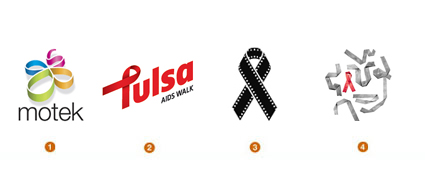 There are surely entire cities in China that owe their existence to the export of magnetic cause ribbons. When did cause ribbon become a punch line? Yes, we want to show we care, but the literal rainbow of causes have become so diluted with this icon that its soul is on the verge of extinction. There is not a lack of concern for these causes as much as a recognition that we have been gorging ourselves at the ribbon trough too long and maybe it's time to purge. Fortunately, there are designers who have stepped in to offer CPR to this flagging icon. Many of the best logos that base themselves on the ribbon were created at the early end of this trend. There are still novel opportunities and unique application to be found with the ribbons, but they will be fewer and farther between. It will be interesting to see if the sustainability trend crosses paths with this trend. Then we'll figure out a great recycling plan for the ribbons so our landfills aren't knee deep in magnetic rubbish. 1.Design Firm: Seamer Design Client: Motek Trading 2.Design Firm: Ty Wilkins Client: Tulsa AIDS Walk 3. Design Firm: Square One Client: Cinema Fighting Cancer 4. Design Firm: Felix Sockwell Client: AIDS National Quality Center Other trends that are here and emerging:
|